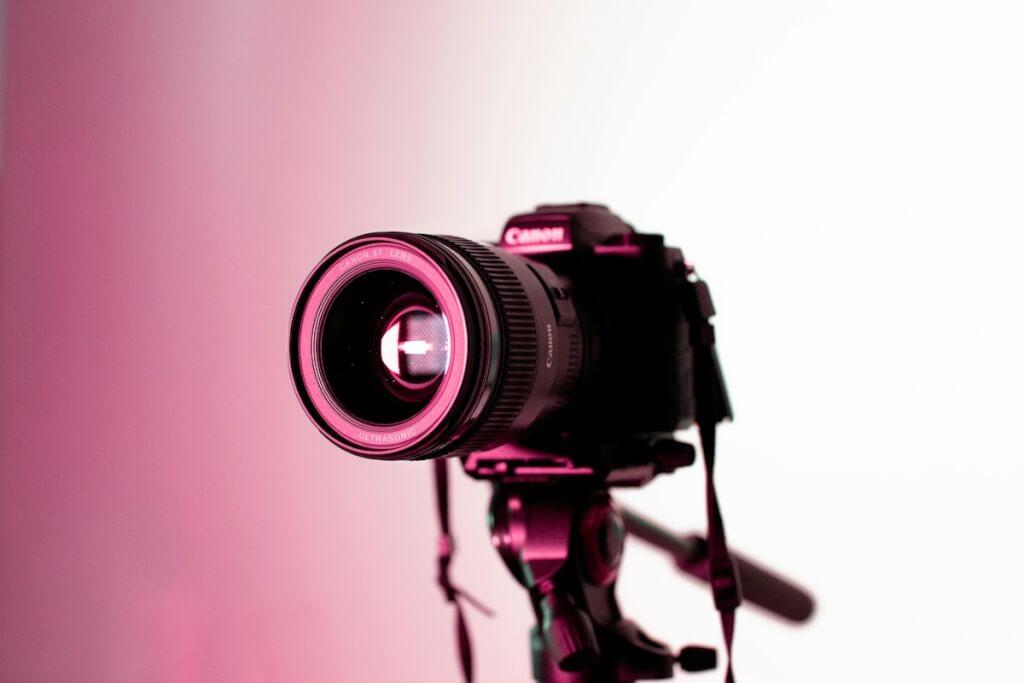
When I’m working with B2B clients on their marketing strategy, one area that often gets overlooked is the image style guide. It’s understandable – when you’re running a professional services firm or a manufacturing company, thinking about whether people in your photos should be looking at the camera or what aspect ratio to use feels like a detail too far. But here’s what I’ve learned over years of advising UK businesses: those details matter enormously, and having a proper image style guide can transform how your brand is perceived and, ultimately, how much revenue you generate.
An image style guide is essentially a set of rules and guidelines that govern how visual content represents your brand. This includes everything from the types of settings you photograph, what people wear, their positioning, the colour palettes you favour, the lighting you use, and even technical specifications like aspect ratios and file formats. When implemented properly, these guidelines ensure that every image associated with your brand reinforces the same messages and creates the same emotional response, regardless of where it appears or who created it[1][2][3].
Why B2B Brands Need Image Style Guides
The research on brand consistency is compelling. Studies show that consistent branding can increase revenue by up to 23%[4][5], and using a consistent colour palette alone can boost brand recognition by 80%[4]. For B2B brands operating in competitive markets, these aren’t trivial numbers. They represent the difference between being remembered and being forgotten, between commanding premium pricing and competing on cost alone.
I’ve seen this play out repeatedly with clients. A professional services firm I worked with had different team members sourcing imagery for their website, social media, and printed materials. The result was a visual hodgepodge – some images were bright and casual, others were dark and corporate, and there was no consistency in how people were portrayed. Potential clients visiting their website couldn’t get a clear sense of who the firm was or what they stood for. After implementing a comprehensive image style guide, their brand recognition improved measurably, and more importantly, their conversion rates increased[6][7].
The ROI case for visual consistency extends beyond immediate revenue gains. Brands with consistent visual identity enjoy 3.5 times greater market visibility[4], and they can command price premiums because strong branding builds trust[4][8]. In B2B contexts where purchase decisions involve multiple stakeholders and longer sales cycles, this trust factor becomes even more critical[9][10].
Three Industry-Specific Image Style Guide Examples
Let me walk you through three practical examples of image style guides tailored to different B2B sectors. These aren’t theoretical – they’re based on real approaches I’ve seen work in UK businesses.
Professional Services Firms: Building Trust Through Visual Consistency
For professional services businesses such as law firms, accountancy practices, or management consultancies, the image style guide needs to communicate expertise, approachability, and trustworthiness. These firms often struggle with appearing too stuffy or too casual, and the images they use play a major role in striking that balance[11][10][12].
A professional services image style guide might specify that photographs should feature real team members rather than stock images, reinforcing authenticity[13][3]. People in images should be dressed in business casual attire – smart but not overly formal – to project professionalism without seeming unapproachable[14][15]. The guide might specify that subjects should make eye contact with the camera in headshots to build connection, but look slightly off-camera in candid shots to create a more natural, documentary feel[11][16].
Colour choices matter enormously here. The style guide should specify a palette that leans towards muted, sophisticated tones rather than bright primary colours[1][3][14]. Lighting should be natural or appear natural, avoiding the harsh, artificial look that screams “stock photo”[3][17][16]. Settings should include real office environments, client meeting spaces, or neutral backgrounds – never generic conference rooms that could be anywhere[18][19].
Aspect ratios need consideration too. For LinkedIn, where professional services firms do much of their marketing, images should be optimised at 1200 x 627 pixels for posts and 400 x 400 pixels for company logos[20]. The guide should also specify that all team photography includes diverse representation, reflecting modern professional environments[21][16].
Manufacturing Companies: Showcasing Capability and Innovation
Manufacturing businesses face a different challenge – they need to demonstrate technical capability, innovation, and reliability whilst avoiding the trap of looking outdated or purely industrial[9][22]. The image style guide for a manufacturing company needs to balance showing real facilities and processes with creating an aspirational sense of modern efficiency.
For manufacturers, I recommend style guides that emphasise clean, well-lit environments even when photographing factory floors or production lines[3][22][17]. Images should feature state-of-the-art equipment and technology prominently, reinforcing innovation[1][23]. When people appear in manufacturing imagery, they should be shown actively engaged with machinery or processes, wearing appropriate safety equipment that looks modern and well-maintained[22][24].
The colour palette for manufacturing companies often draws from industrial tones – greys, silvers, deep blues – but should include accent colours that add energy and modernity[3][22][16]. Lighting is crucial; manufacturing environments can look dark and dated, so the style guide should specify bright, even lighting that showcases cleanliness and precision[3][25].
Composition guidelines might specify that machinery and products should be photographed with plenty of negative space to emphasise quality and attention to detail[16][26]. Close-up shots of manufacturing processes or product details can demonstrate precision and craftsmanship[17][24]. The guide should also address how to photograph the end products – whether on clean white backgrounds for a premium feel or in use contexts to show real-world application[23][27].
Technical specifications matter too. Manufacturing companies often need images across various channels, from large-format trade show graphics to website thumbnails, so the style guide should specify minimum resolutions and preferred file formats[28][29].
Technology Sector: Projecting Innovation and Accessibility
Technology companies, whether they’re SaaS providers, hardware manufacturers, or IT consultancies, need to appear innovative and cutting-edge whilst remaining accessible and trustworthy[1][9]. Their image style guide needs to walk a fine line between showcasing technical sophistication and avoiding imagery that feels cold or intimidating.
For tech sector clients, I typically recommend style guides that favour bright, open spaces with modern furnishings rather than the stereotypical dark room full of servers[17][19]. When showing products, whether hardware or software interfaces, images should use clean backgrounds that don’t distract from the technology itself[16][23]. Apple’s approach – clean white backgrounds with products shot in perfect detail – has become something of an industry standard for good reason[23].
People in technology company imagery should represent diverse teams working collaboratively[21][16]. The guide might specify casual dress codes – reflecting actual tech company culture – but clothing should be tidy and thoughtfully chosen to align with brand colours[14][15]. Avoid the cliché of everyone staring at screens; instead, show people interacting, discussing, or actively solving problems[30][17].
Colour palettes for tech companies often incorporate bold accent colours against neutral bases, communicating both professionalism and innovation[1][16][26]. The style guide should specify how to use these colours – perhaps as backgrounds, in graphics overlays, or through strategic prop placement[14][16].
For software companies especially, the style guide needs to address how to photograph or screenshot user interfaces consistently, including considerations around screen glare, colour calibration, and how to highlight specific features without cluttering the image[21][20].
Common Pitfalls to Watch Out For
Through working with dozens of B2B brands on their visual identity, I’ve seen certain mistakes crop up repeatedly. Being aware of these can save you considerable time and money.
The first major pitfall is relying too heavily on stock photography[13][30][31]. I understand the temptation – stock images are readily available and often beautifully shot. However, they lack authenticity and your audience can spot them a mile away[13][15]. Generic stock photos of people in suits shaking hands or pointing at laptops don’t communicate anything distinctive about your brand, and they actively undermine trust[31][32]. If budget constraints make custom photography difficult, it’s better to use fewer, more authentic images than to pepper your materials with obvious stock shots[30][15].
Inconsistency between channels represents another common error[2][33][15]. Your website might use one style of photography, your social media another, and your printed materials something else entirely. This fragmentation confuses your audience and dilutes your brand identity[2][34]. Every touchpoint should feel like it comes from the same brand family[2][35].
Many B2B brands also make the mistake of creating overly complex style guides that nobody actually uses[15][32][36]. If your guide runs to 100 pages and requires a design degree to interpret, it won’t get followed[32][16]. The best style guides I’ve seen are visual and intuitive, heavy on examples and light on technical jargon[2][7][36].
Outdated imagery poses a significant problem too[31][32]. I’ve seen companies still using photographs from five or ten years ago, with hairstyles and technology that clearly date the content[31]. Your imagery should feel current, reflecting how your business operates today rather than how it looked when you launched your last website[15][31].
Another pitfall involves ignoring technical specifications and file management[3][28][37]. Without clear guidance on image dimensions, file formats, and naming conventions, you’ll end up with a chaotic asset library where nobody can find what they need[33][34][37]. This inefficiency wastes time and increases the likelihood that people will simply use whatever image is easiest to find rather than what’s most appropriate[33].
Finally, many B2B brands create style guides and then fail to enforce them[7][15][34]. Without clear ownership and accountability, guidelines gradually get ignored until you’re back where you started[34][38]. The guide needs champions within the organisation who ensure it’s actually followed[33][34].
Maintaining Consistency: Practical Approaches
Creating an image style guide is one thing; maintaining consistency across your organisation is quite another. Based on what I’ve implemented with clients, here are the approaches that actually work.
Digital Asset Management systems have become essential tools for brand consistency[33][39][34]. These platforms provide a centralised repository where approved images are stored, tagged, and made easily accessible to everyone who needs them[33][34][40]. Systems like Brandfolder, Bynder, or Frontify not only store your assets but also embed your brand guidelines directly into the workflow[39][41][36]. When someone goes to download a logo or select a photograph, they can see immediately how it should be used[33][34].
I typically recommend that B2B brands implement version control as part of their asset management approach[34][37]. This ensures that when images are updated or refreshed, everyone has access to the latest versions and outdated assets are archived rather than deleted[34]. This proves particularly valuable for professional services firms where team photographs need regular updating as people join and leave[31][32].
Creating templates represents another effective consistency tool[7][36]. By providing pre-built templates for common materials – presentations, social media posts, email headers – you make it easy for team members to create on-brand content without needing design expertise[7][36]. These templates should incorporate approved imagery and lock down the elements that shouldn’t be changed whilst allowing flexibility where appropriate[36][42].
Regular audits of your visual content help maintain standards over time[33][37][16]. I recommend quarterly reviews where you look across all your channels – website, social media, printed materials, advertising – to check that imagery remains consistent with your guidelines[37][16]. This process often reveals drift that’s happened gradually, allowing you to course-correct before inconsistency becomes entrenched[15][16].
Training proves crucial, particularly for larger organisations or businesses that work with external agencies and freelancers[7][33][16]. Your style guide should be accompanied by onboarding sessions that walk people through not just what the rules are but why they matter[7][33]. When people understand the strategic thinking behind the guidelines, they’re much more likely to follow them[7][16].
For businesses working with external photographers or agencies, the style guide needs to be specific and visual[3][14][16]. Photographers are visual people; they need to see examples of what you want, not just read descriptions[43][44]. Provide reference images, mood boards, and specific examples of the style you’re seeking[14][16][43].
The Business Case: Understanding the ROI
When I’m presenting recommendations to B2B clients, the conversation inevitably turns to ROI. What’s the actual business impact of investing time and money in developing and maintaining image style guides?
The data here is quite persuasive. As mentioned earlier, consistent branding can deliver a 23% revenue increase[4][5], with some studies showing impacts as high as 33%[4]. For a mid-sized B2B company turning over £5 million annually, that could mean over £1 million in additional revenue simply from presenting a more consistent brand identity[4][5].
The mechanisms driving this ROI are multiple. First, consistent visual identity significantly reduces customer acquisition costs[45][8]. When your brand is easily recognisable and projects professional competence, prospects are more inclined to trust you from the first interaction[45][5][8]. This trust accelerates the sales cycle and reduces the amount of proof required to close deals[9][46].
Second, visual consistency increases customer lifetime value[45][8]. Clients who clearly understand what your brand represents and who develop strong associations with your visual identity are more likely to return for additional services and to recommend you to others[45][5]. In B2B contexts where client relationships often span years or decades, this compounds significantly[9].
Operational efficiency represents another ROI driver that’s often overlooked[7][33][34]. When everyone in your organisation knows exactly where to find approved imagery and how to use it, you eliminate the wasted time of searching through disorganised file systems or recreating assets that already exist[33][34]. Studies indicate that 83% of employees have had to recreate assets because they couldn’t find them[33]. For a team of ten people, even saving an hour per week through better asset management translates to £50,000+ annually in recovered productivity[33].
Marketing efficiency improves too[4][45][8]. Consistent brands report needing 1.75 times less media spend to achieve the same growth as inconsistent brands[4]. When your visual identity is distinctive and consistent, every pound you spend on advertising or content marketing works harder because recognition and recall are higher[4][5].
From a competitive positioning perspective, strong visual consistency allows B2B brands to command premium pricing[4][45][8]. When prospects perceive your brand as more professional, more established, and more credible than competitors – perceptions that consistent, high-quality imagery reinforces – they’re willing to pay more for your services[4][45][8].
The metrics you should track to measure this ROI include brand recognition and recall studies conducted before and after implementing your style guide[47][48]. Monitor how quickly prospects move through your sales funnel and whether conversion rates improve[47][48]. Track customer acquisition costs and customer lifetime value over time[45][47]. Look at engagement metrics on your marketing content – do consistent visuals generate more clicks, shares, and enquiries?[47][48]
For B2B companies using their website as a primary marketing tool, consistent imagery can significantly impact performance metrics[13][48]. Studies show that 38% of consumers will leave a website that looks uninviting or unprofessional[33]. High-quality, consistent imagery keeps people on your site longer and encourages them to explore further[13][48].
Moving Forward with Your Image Style Guide

If you’re convinced that your B2B brand needs an image style guide – or that your existing guide needs refreshing – here’s how I’d recommend approaching the project.
Start by auditing your current visual content across all channels[16][43]. Gather examples of everything you’re currently using and look for patterns, both positive and negative[16]. What’s working well? What feels off-brand? Where are the biggest inconsistencies?[16] This audit provides your baseline and helps identify the gaps your style guide needs to address[16].
Define your brand’s visual principles before getting into specific technical details[3][16][43]. What feelings should your imagery evoke? What values should it communicate? For a professional services firm, this might be trust, expertise, and approachability[10][12]. For a manufacturer, perhaps precision, innovation, and reliability[9][22]. These principles guide all the specific decisions that follow[3][16].
Develop your guidelines collaboratively rather than in isolation[7][16]. Involve people from across your business – marketing, sales, senior leadership – to ensure the guide reflects how the business actually operates and where it’s heading[7][16]. If you work with external agencies or photographers, bring them into the conversation too[3][14][16].
Make your guide visual and example-driven[2][7][36]. For every rule or specification, provide examples showing both correct and incorrect applications[2][7][43]. This makes the guide much more usable, particularly for people who aren’t designers[36][43].
Keep the guide accessible[33][36][49]. Whether you create a PDF document, build a dedicated microsite, or use a platform like Frontify or Standards, ensure that everyone who needs the guide can easily access it[36][49][50]. The best guide in the world is useless if nobody can find it when they need it[33][36].
Plan for evolution[7][16]. Your style guide shouldn’t be carved in stone; it needs to adapt as your brand grows, as design trends shift, and as new channels emerge[7][16]. Build in regular review points – annually at minimum – to assess whether the guide still serves your needs[16].
Finally, invest in the photography and assets you need to bring your guide to life[13][3][14]. Custom photography costs money, but it’s an investment that pays dividends through stronger brand recognition, better marketing performance, and improved competitive positioning[45][5][13]. If budget is limited, prioritise the highest-impact imagery first – perhaps your team headshots and your hero website images – and build your library over time[30][31].
The truth is that in today’s visually saturated B2B marketplace, image style guides have moved from nice-to-have to essential. The brands that invest in creating comprehensive guidelines and actually maintain consistency across all their visual touchpoints are the ones that build stronger recognition, command premium pricing, and grow faster than their competitors. For UK B2B marketers looking to strengthen their brand position and improve marketing ROI, developing a robust image style guide represents one of the highest-value activities you can undertake.
References and Further Reading
[1] Graphic Design Styles: A Comprehensive Guide for B2B Brands in 2025. https://www.frontmatter.io/blog/graphic-design-styles-a-comprehensive-guide-for-b2b-brands-in-2025
[2] 30 Brand Guideline Examples to Inspire You. https://www.vistaprint.co.uk/hub/best-brand-guidelines
[3] How To Develop Your Brand’s Photography Style Guide in 2025. https://www.spencercobby.co.uk/how-to-develop-your-brands-photography-style-guide/
[4] Best Brand Consistency ROI Statistics 2025. https://www.amraandelma.com/brand-consistency-roi-statistics/
[5] The Long-Term Benefits of Investing in a Strong Visual Identity. https://www.creativeideaz.co.uk/blog/the-long-term-benefits-of-investing-in-a-strong-visual-identity
[6] The Ultimate Guide To Creating a B2B Branding Strategy. https://clearviewsocial.com/blog/the-ultimate-guide-to-creating-a-b2b-branding-strategy/
[7] Your B2B Brand Style Guide Must Evolve as You Do. https://green-hat.com.au/articles/your-b2b-brand-style-guide-must-evolve-as-you-do
[8] How Inconsistent Branding Kills Campaign ROI. https://www.yourethos.io/blog-posts/how-inconsistent-branding-kills-roi
[9] B2B Branding: Detailed Guide & Best Practices. https://markenfels.ch/en/b2b-branding/
[10] Demystifying Branding for Professional Services. https://psm-theprofessionals.com/demystifying-branding-for-professional-services/
[11] 5 Tips to Develop Your Brand’s Photography Style Guide. https://www.eyeem.com/blog/5-tips-to-develop-your-brands-photography-style-guide
[12] Brand Design for the Professional Services Firm. https://hingemarketing.com/blog/story/brand-design-for-the-professional-services-firm-the-ultimate-guide-for-marketers-and-execu
[13] B2B Website Design: Best Practice and Examples. https://radicalwebdesign.co.uk/blog/b2b-website-design/
[14] How to Choose the Right Editing Style: Build Your Brand’s Photography Style. https://www.donnagreenphotography.co.uk/how-to-choose-the-right-editing-style/
[15] 5 Brand Photography Mistakes to Avoid. https://www.brandingbykaysha.com/blog/branding-photography-mistakes
[16] How To Create a Photography Style Guide: Expert Guide. https://www.squareshot.com/post/how-to-create-a-photography-style-guide-expert-guide
[17] Brand Photography: Types, Examples, and Creation. https://www.ramotion.com/blog/brand-photography/
[18]
[19] The Complete Guide to Brand Photography, Business Portraits & Headshots Scotland. https://rebeccaholmesphotography.com/the-complete-guide-to-brand-photography-business-portraits-headshots-scotland/
[20] The 2023 B2B Social Media Image Size Guide. https://www.bopdesign.com/bop-blog/2023/01/2023-b2b-social-media-size/
[21] Stand Out in B2B: Branding Guidelines & 50+ Examples. https://www.contentbeta.com/blog/brand-guidelines-b2b/
[22] Best Manufacturing Logo Designs of 2025. https://www.designrush.com/best-designs/logo/manufacturing
[23] 20 Trending Product Photography Examples Of Growing Brands. https://imageretouchinglab.com/product-photography-examples/
[24] The 10 Types Of Branding Photos You Need For Your Business. https://mirandakelton.com/blog/types-of-personal-branding-business-photos
[25] How to Make a Fashion Photography Style Guide. https://www.profoto.com/it/en/studio-solutions/tips-tricks/how-to-make-a-fashion-photography-style-guide/
[26] 15 Brand Visual Identity Examples That Stand Out Today. https://www.columnfivemedia.com/15-examples-of-brand-visual-identity/
[28] When and How to Use Images in B2B Emails. https://martech.org/when-and-how-to-use-images-in-b2b-emails/
[29] Size Matters: 3 Ways To Optimize Images For Better B2B Content Marketing. https://blog.orangemarketing.com/%EF%B8%8F-3-ways-to-optimize-images-for-your-content-marketing
[30] Choosing the Right Images for B2B Social Media Success. https://www.jdrgroup.co.uk/blog/what-images-should-your-b2b-post-on-social-media
[31] 5 Mistakes Small Business Owners Make With Their Brand Photos. https://www.katiemayerphotography.com/blog/5mistakessmallbusinessesmakewithphotos
[32] Common Brand Photography Mistakes to Avoid. https://www.alicialeighphoto.com/blog/common-brand-photography-mistakes-to-avoid
[33] 5 Key Digital Asset Management Strategies for Consistent Branding. https://filecamp.com/blog/dam-strategies-for-consistent-branding/
[34] Why Digital Asset Management is Essential for Brand Consistency. https://www.simple.io/blog/digital-asset-management-essential-for-brand-consistency
[35] Mastering Visual Content Marketing: Best Practices for Eye-Catching Content. https://todaydigital.com/blog/mastering-visual-content-marketing-best-practices-for-eye-catching-content/
[36] Best Tools To Create A Style Guide Online. https://www.ebaqdesign.com/blog/digital-style-guide
[37] How to Manage Company Images in 2025. https://www.frontify.com/en/guide/image-management
[38] How to Maintain Brand Consistency with a DAM Platform. https://www.canto.com/blog/brand-consistency/
[39] Top 10 Digital Asset Management (DAM) Companies to Watch in 2025. https://www.vsn-tv.com/blogs/top-10-digital-asset-management-(dam)-companies-to-watch-in-2025
[40] What Is Brand Asset Management? All You Need To Know. https://openasset.com/resources/what-is-brand-asset-management-everything-you-need-to-know/
[41] The Best 5 Digital Asset Management Platforms in 2025. https://www.papirfly.com/blog/digital-asset-management/top-digital-asset-management-solutions-comparison/
[42] Create a Brand Style Guide for Your Business. https://www.adobe.com/creativecloud/business/teams/resources/how-to/brand-guide.html
[43] How to Create a Consistent Brand Style Guide. https://www.canva.com/learn/your-brand-needs-a-visual-style-guide/
[44] Style Guide. https://www.marenelizabethphotography.com/style-guide/
[45] The ROI of a Modern Visual Brand Identity. https://www.eloqwnt.com/blog/roi-of-branding
[47] The ROI of Visual Identity: How to Track Your Brand’s Impact. https://www.yokedesign.studio/dispatches/the-roi-of-visual-identity-how-to-track-your-brands-impact
[46] Why Brand Consistency Matters for B2B Brands. https://renegademarketing.com/blog/why-brand-consistency-matters-for-b2b-brands/
[48] Visual Consistency Powers Successful Brands. https://www.siteimprove.com/blog/visual-consistency-meaning/
[49] Style Guides: Your Brand Playbook with Real Examples. https://www.frontify.com/en/guide/style-guide
[50] Standards: Build Stunning Brand Guidelines Online. https://standards.site

Leave a Reply