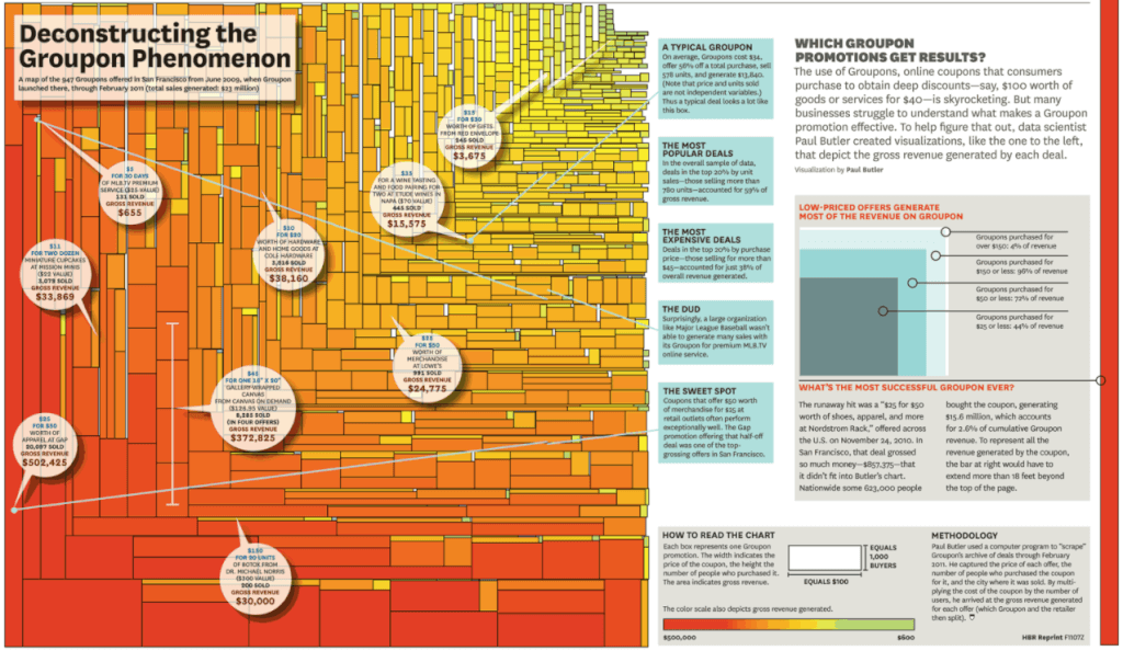
This is fascinating, a wonderful example of the visual display of quantitative information that works: https://hbr.org/2011/07/vision-statement-deconstructing-the-groupon-phenomenon
Paul Butler used a computer programme to ‘scrape’ Groupon’s archive of deals through to February 2011. He captures the price of each offer, the number of people who purchased the coupon for it and the city where it was sold.
By multiplying the cost of the coupon by the number of users, he arrived at the gross revenue generated for each offer (which Groupon and the retailer then split).
Have a look for yourself: https://hbr.org/2011/07/vision-statement-deconstructing-the-groupon-phenomenon …my thanks to Harvard Business Review for publishing this.
So do you think this looks like success? And if so, who for?



Leave a Reply